Well, I've completed all my entries for my Danish Design Journal. I have to admit that I'll miss it a bit. I have a new soft spot for both Blogging and Danish Design alike. I had a bit of time this evening so I took the opportunity to take some pictures of details from the streets in the town where I live. What could be a better way to celebrate the end of a Danish Design semester?
Saturday, April 24, 2010
4/23/10: Symposium #8, Public Spaces, Public Life
Go to Gammeltorv and look at the new statues of homeless people...What is it all about? How do people react and interact with them? If the statues were real human beings, would they react differently to it? Is Gammeltorv a good place for such an instillation? Is there any other public space in Copenhagen that would be more suitable than Gammeltorv, and for what reason?
Just yesterday I stumbled upon Welcome HomeLess statues in Gammeltorv. My immediate thought was that a group of those statue performers had gathered in the square and were all doing their unmoving act - that is how lifelike they appear. But on closer inspection, I realized that they were, in fact, real statues. Crowding Gammeltorv, the 13 statues are impossible to miss. Their lifelike expressions and postures are both disconcerting and intriguing, and so compelled me to wind my way through them. On the other hand, as portrayals of homeless individuals, they exude a sadness and discomfort that makes the viewer slightly embarrassed to look. Of course, it is this double reaction that the statues are meant to create so that people's reaction to the homeless, that of both spectacle and something to try and ignore, can be addressed and critiqued.
The project is meant to make people stop and think for a moment on the problem of homelessness, to make them realize that it is all around us, and it happens to all kinds of people. To do this, the project depicts homeless people as being both men and women, young and old. Cast in metal, the people don't seem to be of any particular race. They are poignant and pull the viewer to look a little more carefully and ask, why is this person homeless?
But the most successful move that the project made was to place the exhibit on Gammeltorv, right between two parts of Strøget, the walking street, but also in close proximity to København University. Not only does the University mean that the area is progressive leaning, meaning that viewers will be more receptive to it's message, but shoppers from Strøget will have a hard time avoiding the sculptures. There is something powerful about walking down the street after spending large amounts of money in shops and then being faced with 13 statues of homeless individuals. In that moment, you are forced to reconsider your privileged position in comparison to so many other people out there. Although Strøget already has a few regular beggers that shoppers are accustomed to, the appearance of 13 sculptures overnight is something that people, regardless of how busy they are, simply can't overlook. The only other place that could have been just as good of a location would have been father up Strøget, at Amagertorv, but I do think Gameltorv is an ideal location.
Being in Copenhagen, one rarely see homeless people. Never before have I been in a city with so few people begging on the street. As a result, it is easy to forget just how lucky we. Therefore, the exhibit puts Copenhagen into perspective, and reminds the Danes that just because they benefit from the Welfare State everyday does not mean that everyone else is so fortunate.
Friday, April 23, 2010
4/20/10: Symposium #7, Danish Transportation
Compare and contrast the Copenhagen transit system to another one you know well. Discuss what you believe are strong elements in Copenhagen's public transportation and the areas you think the city could improve upon. What does Copenhagen do that might be applicable to your city? Does the city you chose have any examples or ideas that Copenhagen could adopt? Which transit system to you feel safer riding?
Considering that I use the Copenhagen transit system practically every day, it is certainly my most familiar public transportation system. Feeling comfortable on the train, bus, and metro, I appreciate the safety, cleanliness, and dependability that all three provide. When compared to the other transportation system I know, the Boston commuter rail and train system, Copenhagen's public transportation appears newer, better designed (logistically, aesthetically, and structurally), and easier to navigate. Nevertheless, I can think of a suggestion or two for Copenhagen that I see working well in Boston.
A few of the things I appreciate about the Boston train system that could be employed in Copenhagen:
- You can buy plastic cards for the train that you can refill at your leisure. These cards last indefinitely and cut down on waste. They can also be filled monthly at a reduced cost for people who use the trains regularly. They fit into a wallet and so are easy to use and carry. I think these cards make much more sense than the kilp cards that end up littering bus stops and train platforms, and the navy blue passes that need to be replaced somewhat regularly. The cards, called Charlie cards, are simply more efficient.
- The trains in Boston and its surrounding metro areas are color coded. You could never get onto the wrong train because you would immediately tell as the train pulls into the station whether or not it's the green line or not.
http://lauramcwilliams.files.wordpress.com/2009/08/bostongreenline.jpg
- Express trains or trains traveling further are clearly marked and not easily confused with other local trains. Most often they are on entirely different platforms. This is not always the case in Copenhagen, especially at Nørreport and I have known several people who have accidentally rode these trains far out of the city without an opportunity to get off.
- Public transportation is hands down less expensive in Boston. Perhaps, Copenhagen has made it more expensive because they are trying to encourage people from biking instead. Nevertheless, Copenhagen's prices are steep. Then again, the price of everything in Copenhagen is steep.
- Many of the trains and stations in and around Boston are simply old and worn down. If the city could invest more into the design an upkeep of both the trains and stations, I'm sure more people would be willing to take them.
Dark and dingy inside of a typical Boston train platform http://www.universalhub.com/images/2009/dtxsmoke.jpg
- One of the things I was most interested in about Copenhagen's stations is their use of light and elimination of dark corners. Making sure their stations are safe places, even at night, makes such a difference to passengers. I have never once felt unsafe in a Copenhagen train station but I am sure there are many stations in Boston that I simply would not want to be at night.
- Boston stations do not show waiting and arrival times for the trains. Many of them do not even have a schedule of when the trains are supposed to arrive. I think adding these few little things would make the train waiting process so much better.
Copenhagen Metro Station, clean, well lit, and easy to navigate because of its arrival time display
http://farm4.static.flickr.com/3239/3151069958_16078030e8.jpg
- Although there is a commuter line that goes from Boston to outlying suburbs, many areas simply have no access to public transportation. Adding bus lines that reach more suburban areas would reduce car traffic. Considering that traffic in Boston is a real problem with it's continuous construction projects and confusing old roads, these busses would be a great asset. Of course, these busses would have to be clean and reliable so that commuters would want to ride them.
- Proving wireless internet for commuters is an excellent service that the Copenhagen transit system offers its commuters. Overall, their use of technology is something Boston could learn from, such as the text messages commuters can receive when their train or bus is coming.
Monday, April 19, 2010
4/16/10 Lecture Reflection: Transportation Design and Architecture
Today's lecture interested me most by its portrayal of transportation design as something equally forward thinking as it is backwardly referential. A quick analysis of London's St. Pancras train station demonstrates how early stations were more than transportation hubs but icons of development, designed to look more like cathedrals than anything. While these grand buildings stood as emblems of progress and acted as status symbols, they also posed a logistical problem - they simply took up too much space. To hide the often ugly new technology, stations were built to cover it up from the public eye. In this instance, similar to Copenhagen's Central Station, St. Pancras stood as both a sign of what was to come (the train is the classic symbol of inevitable technological progress), but nevertheless strove to resemble great buildings of old. Cities may have been proud of these technological giants, but they did not want to scare their citizens with too much change too fast and so disguised them, ironically, as places of worship.
From this point forward, the main task of transportation designers was the successful integration of traffic. Because transportation infrastructure is difficult to completely disband considering that people still need to get from place A to B, much of transportation design occurs as improvement or renovation, as opposed to creation. Of course, thinking back to the beginning of the semester, all design is simply the development of some pre-existing idea, the improvement of things already created. Once again, then, we are faced with the predicament of needing to move forward while being firmly tied to the past.
Despite often needing to working within an existing framework, Danish Transportation Design seems to be making considerable headway. The plan for the new Nørreport Station in Copenhagen, designed by Public Arkitekter is a perfect example of how Danish transportation design is particularly innovative. In a response to the high level of traffic around the station that isolates it like an island and makes it dirty, congested, and uninviting, traffic has been shifted to that both directions of traffic are on the same side of Nørreport. This not only makes traffic simpler but creates a city pavilion out of the station, leaving space for vendors and cafes. Pavilions will make use of natural light, glass, and curved spaces so as to prevent crime and make the space safe and inviting. Also important are the 3000 spaces for bike parking. The parking looks to the future when even for Danes will use a bike as their primary means of transportation. As functional as the parking is, it is still aesthetic by being contained in depressions in the ground that do not impede sight lines. But incorporated into all of these new features are the subway ventilation pipes that cannot be removed. Also, the subway platforms themselves, while receiving a face-life, are not being expanded as they should be due to lack of funding. Thus, the old exists with the new, and in many way, dictates what new things can and cannot be.
http://i.telegraph.co.uk/telegraph/multimedia/archive/01157/portal-graphics-20_1157354a.jpg
Space taken up by St. Pancras Station
http://static.worldarchitecturenews.com/news_images/1325_1_1000%20St%20Pancras.jpg
Space taken up by St. Pancras Station
http://static.worldarchitecturenews.com/news_images/1325_1_1000%20St%20Pancras.jpg
From this point forward, the main task of transportation designers was the successful integration of traffic. Because transportation infrastructure is difficult to completely disband considering that people still need to get from place A to B, much of transportation design occurs as improvement or renovation, as opposed to creation. Of course, thinking back to the beginning of the semester, all design is simply the development of some pre-existing idea, the improvement of things already created. Once again, then, we are faced with the predicament of needing to move forward while being firmly tied to the past.
Despite often needing to working within an existing framework, Danish Transportation Design seems to be making considerable headway. The plan for the new Nørreport Station in Copenhagen, designed by Public Arkitekter is a perfect example of how Danish transportation design is particularly innovative. In a response to the high level of traffic around the station that isolates it like an island and makes it dirty, congested, and uninviting, traffic has been shifted to that both directions of traffic are on the same side of Nørreport. This not only makes traffic simpler but creates a city pavilion out of the station, leaving space for vendors and cafes. Pavilions will make use of natural light, glass, and curved spaces so as to prevent crime and make the space safe and inviting. Also important are the 3000 spaces for bike parking. The parking looks to the future when even for Danes will use a bike as their primary means of transportation. As functional as the parking is, it is still aesthetic by being contained in depressions in the ground that do not impede sight lines. But incorporated into all of these new features are the subway ventilation pipes that cannot be removed. Also, the subway platforms themselves, while receiving a face-life, are not being expanded as they should be due to lack of funding. Thus, the old exists with the new, and in many way, dictates what new things can and cannot be.
Friday, April 16, 2010
4/14/10 Field Study: Copenhagen Walking Tour and Danish Architecture Centre
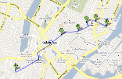
Reflecting upon the group walking tour, now map your own route through your favorite part of the city with what you consider to be the best ‘civic design’ attributes. In short, design a map that marks a preferred route which point out the key spots and areas you believe embody the theme best. Include a brief description of what you understand this ‘theme’ to mean, and also provide individual descriptions/briefs of each of the spots/areas you have noted on the map.
Trying to describe to a friend why I liked Copenhagen, I found myself repeatedly using the world 'livability'. Although the word seems straightforward, understanding why some cities are able to achieve urban livability while others cannot often seems much less explicit. But by taking a close look at what is inviting and exciting about Copenhagen, it seems that a key ingredient is creating intimate spaces in public environments. These 'urban living rooms,' spaces that a demarcate private areas in the midst of fast paced downtown areas, inspire a feeling of personal identification with the city and invite inhabitants to slow down and enjoy the beautiful details of Copenhagen. Such private spaces, in addition to the careful design Copenhagen employs to ensure that the city is both functional and aesthetic from details as small as the man hole covers and as large as the street plans are what makes it such a livable city. Here are a few examples of spots not to miss when walking (or biking!) Copenhagen:
Nyhavn
Although this street is wide and open, overlooking the water, the colorful buildings, small cafes, and ample outdoor seating makes the area one of the most iconic and enjoyable spots in all of Copenhagen. The combination of lively cafes and young people lounging outdoors with drink in hand, juxtaposed with buildings dating back to the 18th century is a perfect example of how this old world city has captured a young, fresh urban atmosphere.
Pistolstræde
From Nyhavn, walk around to Kongens Nytorv, noticing the successful mix of commercial and cultural buildings and then turn onto Østergade (Strøget), noticing the detail in the sidewalk at the beginning of the street - three bronze towers symbolizing the city inlayed into the paving stones. Just one example of the aesthetic attention to detail that makes Copenhagen such an exciting urban design case study. Make a right onto Ny Østergade and then a left onto a tiny alleyway called Pistolstræde. The alleyway opens up to a courtyard that gives the palpable feling of private space although it is simply a niche of small shops. With trees strung with lights and wide steeps to sit on, Pistolstræde is the perfect location to stop and reflect, eat your lunch in peace, or simply take as a tangent on your walk home. The beautiful spot is especially remarkable when one considers its past. The area was the city's previous Red Light District, full of seedy businesses and unkept buildings. When the area transitioned, this tight, non-corming cluster of buildings (and the space it encapsulated) could have been destroyed. Instead, it was not only kept but converted into a beautiful urban refuge.
Strøget & Amagertorv
After wandering through Pistolstræde, you'll find yourself back on Østergade (Strøget), the walking street. Lined with high quality shops and dotted with street performers and the occasional street vendor, Strøget resembles many other urban shopping districts, except for one notable difference: there are no cars allowed. Pedestrians move freely, creating equal access to both sides of the street. Perhaps the showcase of the walking street is Amagertorv, an unconventional square. It is worth mentioning not only because of it's urban carpet, artistically designed paving stones that attracts the eye (see post 4/13/10) but also because of it's unusual shape. Adjacent to Strøget, the square is anything but symmetrical or rectangular, creating a feeling of freedom and excitement but then at it's south end, it's layout becomes structured and demarcated by flagstone pavers. It's southern tip boasts a large bronze statue and overlooks the institutional sector of Copenhagen. Therefore, as the lack of symmetry at the north corner of Amagertorv reflects the bustling commercial atmosphere of Strøget, the contained and restrained southern end refers to the stateliness of the Parliament buildings that it faces.
Caritasbrønden Fountain at Gammel Torv
Walking farther down Strøget will bring you to another public square, this one with a large, guilt fountain. As a meeting place and a site for bike parking, as well as home to a couple street venders, the square is lively but it's relatively smaller scale makes it cozy. Even in colder weather, you will see people sitting around eating their lunches. Although there are few benches, the fountain itself, as well as a platform left from times of public executions serves as perfect spots for sitting.
Skydebanehaven Park
This final part of the journey takes a bit longer to reach but take the opportunity to observe Copenhagen's smaller details. Notice as patters in the cobblestones change depending on the street your on. Consider the functional and yet aesthetic bus shelters with their corresponding bus signs that not only visibly display the bus numbers that stop there but are also designed as interlocking pieces so that if another bus route picks up that stop, another number can be added without needing to construct an entirely new sign. Quickly look at the city lights, trash cans, and benches, all of which are functional, streamlined, and blend into the urban environment. Your route will take you to the end of Strøget, bringing you to Radhusplasden. Crossing the square will put you on Vesterbrogade which you will walk on until you take a left onto Reventlowsgale. Notice København H, the city's main train station on your left. Take a right onto Istedgade, the heart of Copenhagen's Red Light District. As you walk down this (in)famous street pay careful attention, because you are looking for hidden gem. After several block, on your right hand side, you will see a break in the buildings and a wall that almost looks like a fortress opening. Your curiosity will bring you into a secret garden of sorts. Behind the fortress wall is a public park, equipped with a fabulous children's play ground and plenty of open space to enjoy the outdoors. As beautiful as the park is, its charm comes from it the fact that it is a diamond in the rough Vesterbro neighborhood. Because you won't find Skydebanehaven unless you're looking for it, the spot feels like a secret, reserved only for those who know about it. It is a perfect example of how a public space can be turned into a place of community identification.
Trying to describe to a friend why I liked Copenhagen, I found myself repeatedly using the world 'livability'. Although the word seems straightforward, understanding why some cities are able to achieve urban livability while others cannot often seems much less explicit. But by taking a close look at what is inviting and exciting about Copenhagen, it seems that a key ingredient is creating intimate spaces in public environments. These 'urban living rooms,' spaces that a demarcate private areas in the midst of fast paced downtown areas, inspire a feeling of personal identification with the city and invite inhabitants to slow down and enjoy the beautiful details of Copenhagen. Such private spaces, in addition to the careful design Copenhagen employs to ensure that the city is both functional and aesthetic from details as small as the man hole covers and as large as the street plans are what makes it such a livable city. Here are a few examples of spots not to miss when walking (or biking!) Copenhagen:
Your Walking Tour Map, Thanks to Google Maps
Map Key: (A) Nyhavn; (B) Kongens Nytorv; (C) Pistolstræde; (D) Amagertorv; (E) Caritasbrønden Fountain at Gammel Torv; (F)
Skydebanehaven Park
Map Key: (A) Nyhavn; (B) Kongens Nytorv; (C) Pistolstræde; (D) Amagertorv; (E) Caritasbrønden Fountain at Gammel Torv; (F)
Skydebanehaven Park
Nyhavn
Although this street is wide and open, overlooking the water, the colorful buildings, small cafes, and ample outdoor seating makes the area one of the most iconic and enjoyable spots in all of Copenhagen. The combination of lively cafes and young people lounging outdoors with drink in hand, juxtaposed with buildings dating back to the 18th century is a perfect example of how this old world city has captured a young, fresh urban atmosphere.
Pistolstræde
From Nyhavn, walk around to Kongens Nytorv, noticing the successful mix of commercial and cultural buildings and then turn onto Østergade (Strøget), noticing the detail in the sidewalk at the beginning of the street - three bronze towers symbolizing the city inlayed into the paving stones. Just one example of the aesthetic attention to detail that makes Copenhagen such an exciting urban design case study. Make a right onto Ny Østergade and then a left onto a tiny alleyway called Pistolstræde. The alleyway opens up to a courtyard that gives the palpable feling of private space although it is simply a niche of small shops. With trees strung with lights and wide steeps to sit on, Pistolstræde is the perfect location to stop and reflect, eat your lunch in peace, or simply take as a tangent on your walk home. The beautiful spot is especially remarkable when one considers its past. The area was the city's previous Red Light District, full of seedy businesses and unkept buildings. When the area transitioned, this tight, non-corming cluster of buildings (and the space it encapsulated) could have been destroyed. Instead, it was not only kept but converted into a beautiful urban refuge.
Strøget & Amagertorv
After wandering through Pistolstræde, you'll find yourself back on Østergade (Strøget), the walking street. Lined with high quality shops and dotted with street performers and the occasional street vendor, Strøget resembles many other urban shopping districts, except for one notable difference: there are no cars allowed. Pedestrians move freely, creating equal access to both sides of the street. Perhaps the showcase of the walking street is Amagertorv, an unconventional square. It is worth mentioning not only because of it's urban carpet, artistically designed paving stones that attracts the eye (see post 4/13/10) but also because of it's unusual shape. Adjacent to Strøget, the square is anything but symmetrical or rectangular, creating a feeling of freedom and excitement but then at it's south end, it's layout becomes structured and demarcated by flagstone pavers. It's southern tip boasts a large bronze statue and overlooks the institutional sector of Copenhagen. Therefore, as the lack of symmetry at the north corner of Amagertorv reflects the bustling commercial atmosphere of Strøget, the contained and restrained southern end refers to the stateliness of the Parliament buildings that it faces.
Caritasbrønden Fountain at Gammel Torv
Walking farther down Strøget will bring you to another public square, this one with a large, guilt fountain. As a meeting place and a site for bike parking, as well as home to a couple street venders, the square is lively but it's relatively smaller scale makes it cozy. Even in colder weather, you will see people sitting around eating their lunches. Although there are few benches, the fountain itself, as well as a platform left from times of public executions serves as perfect spots for sitting.
Skydebanehaven Park
This final part of the journey takes a bit longer to reach but take the opportunity to observe Copenhagen's smaller details. Notice as patters in the cobblestones change depending on the street your on. Consider the functional and yet aesthetic bus shelters with their corresponding bus signs that not only visibly display the bus numbers that stop there but are also designed as interlocking pieces so that if another bus route picks up that stop, another number can be added without needing to construct an entirely new sign. Quickly look at the city lights, trash cans, and benches, all of which are functional, streamlined, and blend into the urban environment. Your route will take you to the end of Strøget, bringing you to Radhusplasden. Crossing the square will put you on Vesterbrogade which you will walk on until you take a left onto Reventlowsgale. Notice København H, the city's main train station on your left. Take a right onto Istedgade, the heart of Copenhagen's Red Light District. As you walk down this (in)famous street pay careful attention, because you are looking for hidden gem. After several block, on your right hand side, you will see a break in the buildings and a wall that almost looks like a fortress opening. Your curiosity will bring you into a secret garden of sorts. Behind the fortress wall is a public park, equipped with a fabulous children's play ground and plenty of open space to enjoy the outdoors. As beautiful as the park is, its charm comes from it the fact that it is a diamond in the rough Vesterbro neighborhood. Because you won't find Skydebanehaven unless you're looking for it, the spot feels like a secret, reserved only for those who know about it. It is a perfect example of how a public space can be turned into a place of community identification.
Wednesday, April 14, 2010
4/13/10 Lecture Reflection: Civic Design, Design for the Public
Upon coming to Copenhagen, I most definitely noticed the cobblestones and flag stones that make up the sidewalks and many of the streets. Simply the feeling of stones under foot as opposed to asphalt was enough to make me pay attention, especially since when I got here, the stones were slick and slippery from the snow. The stones may have a million different functions but ease of snow removal is not one of them. As a casual observer, I noticed the different types of stones, and how they delineated spaces and made it clear where one should walk. But after talking of the streets of Copenhagen as an urban carpet and exploring all of the functions that they serve, I've begun to see them as more than just aesthetically pleasing and historically charming, but as the best example of Democratic design I've seen throughout this class.
On the most basic level, the streets are democratic in the sense that anyone can walk on them - and this could apply to any street in any city - but what sets Copenhagen apart is it's attention to detail, aesthetics, and functionality, all of which work together to create urban living spaces. Details such as intricately designed manhole covers that refer to Danish culture and history make pedestrians take a second to stop and enjoy the city. Although these details may seem extraneous, they enrich the city and create a feeling of pride in the inhabitants.
Other similarly aesthetic details such as the stone paving at Amagertorv evokes the feeling of being not just on any street, but in a special, celebrated urban location. And these locations, as beautiful and even artistic as they may be, can be enjoyed by anyone. In a truly democratic spirit, Copenhagen has created a test paving site on Strøget, a 1:1 mock up of possible paving designs so that the Danes can provide feedback about which designs they prefer.
Functionality can be seen through innumerable examples. One is the way that utilities are placed under certain types of stones so that when I repair needs to be done, workers can pop off the right stone, do the work, and replace the stone, without damaging the rest of the street. Such good design saves time and energy for both the road workers and the city inhabitants who do not like dealing with road construction. The pictoform systems, sensory paving for the blind, is also another excellent of example of how functional street design is also democratic. The pictoforms not only help the blind safely navigate the city, but are also aesthetically pleasing for everyone.
The floor may be one of the last places we think of when we consider the design of cities, however, the streets, from the layout down to the construction material and storm drains play a considerably role in how we experience the urban environment. Because Copenhagen pays especial attention to its street design, down to the most minute detail, its streets become a democratic space in which everyone can enjoy and benefit from.
On the most basic level, the streets are democratic in the sense that anyone can walk on them - and this could apply to any street in any city - but what sets Copenhagen apart is it's attention to detail, aesthetics, and functionality, all of which work together to create urban living spaces. Details such as intricately designed manhole covers that refer to Danish culture and history make pedestrians take a second to stop and enjoy the city. Although these details may seem extraneous, they enrich the city and create a feeling of pride in the inhabitants.
Other similarly aesthetic details such as the stone paving at Amagertorv evokes the feeling of being not just on any street, but in a special, celebrated urban location. And these locations, as beautiful and even artistic as they may be, can be enjoyed by anyone. In a truly democratic spirit, Copenhagen has created a test paving site on Strøget, a 1:1 mock up of possible paving designs so that the Danes can provide feedback about which designs they prefer.
Amagertorv stone paving, designed by Bjørn Nørgaard http://ytiffanie.files.wordpress.com/2009/04/amagertorv.jpg
Functionality can be seen through innumerable examples. One is the way that utilities are placed under certain types of stones so that when I repair needs to be done, workers can pop off the right stone, do the work, and replace the stone, without damaging the rest of the street. Such good design saves time and energy for both the road workers and the city inhabitants who do not like dealing with road construction. The pictoform systems, sensory paving for the blind, is also another excellent of example of how functional street design is also democratic. The pictoforms not only help the blind safely navigate the city, but are also aesthetically pleasing for everyone.
Pictoform system, deigned by Knud Holscher
http://www.abbeville.com/images-catalog/full-size/0789203758.interior05.jpg
The floor may be one of the last places we think of when we consider the design of cities, however, the streets, from the layout down to the construction material and storm drains play a considerably role in how we experience the urban environment. Because Copenhagen pays especial attention to its street design, down to the most minute detail, its streets become a democratic space in which everyone can enjoy and benefit from.
Monday, April 12, 2010
3/26/10: Symposium #6, Architecture & Design as a Vehicle for Creating a Welfare State
Discuss your own personal consumption and how it is affected by your dwelling and social identity.
Like everyone else, my consumption is, unfortunately, tied to emotions. I find myself buying things after a bad day, even if I don't need them. I get angry when products have ridiculous amounts of packaging. I feel guilty when I throw things away in the absence of recycling containers. I feel happy after taking a long, hot shower. But I do recognize that these emotions have been socially constructed, shaped by the where and how I live.
Since coming to Denmark, I have noticed some differences between consumption here and the US. For instance, because electricity and water prices are so high, people are constantly aware of how much is being used. My host family is continuously turning off lights and they take the most rapid showers I could imagine. Also, they go food shopping almost everyday, buying fresh groceries for every dinner, as opposed to Americans who usually shop once a week. Both of these habits seem to reflect a greater awareness of the environment and consumption that the Danes have but Americans often lack.
Living with a host family means that I don't really have to buy many things for myself. Where this seems to come the most in handy is in regard to coffee. At home, I go back and forth between buying coffee out and using a french press. I buy coffee for a variety of reasons, most, if not all of them influence by emotions and my social identity - I enjoy sitting in a cafe, or if I take it out, I enjoy holding the paper cup that tells people where I bought coffee, and I just appreciate the convenience. If I use my press, it is because it is inexpensive, but also because I enjoy a leisurely with a cup of coffee at home. Here in Denmark, I simply cannot afford buying coffee out - the price of a cup (usually about half the size of an American cup) is at least double the price. Instead, I have coffee at my host family's home. They have an ingenious machine, called the Nespresso Citiz which makes fantastic espresso and then they have a milk steamer/frother also from Nespresso. This machine uses espresso cartridges - I don't know what else to call them, which are essentially small metal cylinders filled with espresso. For each cup of coffee, one cartridge is used, meaning that every cup of coffee produces a waste product of one metal cartridge.
Nespresso Cartridges - One used for each cup of coffee http://www.singleserveespresso.com/pictures/NespressoCapsules.jpg
Now, I love this machine, but every time I load a cartridge for my morning coffee, I can't help but feel that I am being wasteful. This waste is especially evident when you compare it so a french press. Being in Denmark, of course the Bodum press comes to mind. This little machine makes great coffee and could last for decades. It also costs about 1/10 of the price of the espresso machine, and buying ground coffee for the press is considerably cheaper than buying the espresso canisters. Which leads me to the point that while one's money is not necessarily connected to the amount they consume or waste, it nevertheless allows them to consume and waste more.
And one more thing about this nifty espresso machine. Although it produces large amounts of waste, if you visit their website, they have an entire section on "Ecolaboration," in which they discuss their efforts to produce sustainable coffee, create greener machines, and recycle the canisters. Although I can't quite fault them for trying to be environmentally friendly, I can't help but think of this as a classic example of collective misrecognition. Instead of seeing that their product is actually wasteful, they try to demonstrate how it is good for the environment through backward logic. Even a quick perusal of the "Ecolaboration" section reveals that many countries do not have a recycle location and the machines, by running on electricity, are much less green than other coffee makers such as a french press. These moments of backward environmental logic can seem so attractive, especially when they attempt to tell us that our wasteful decisions are actually good for the planet. It seems that the next challenge is averting these collective misrecognitions and finding what it really means to be environmentally friendly.
Subscribe to:
Posts (Atom)